
The Importance of Responsive Web Design for Small Business Websites
Unlike days of old, simply having an amazing store is not enough for Small Businesses to thrive and compete effectively in the marketplace nowadays. You also need a strong online presence.
As more and more consumers turn to the internet to discover products and services, the usability and accessibility of your
Website play a crucial role in attracting and retaining Customers. So, how can you guarantee this? Luckily for you, we’ve got just the solution you’ve been looking for!
Responsive Website Design has emerged as a vital strategy for ensuring that Small Business Websites deliver an optimal user experience across all devices and screen sizes. Given this, let's explore what responsive Web Design is, its key features and how it propels Small Business Websites to success!
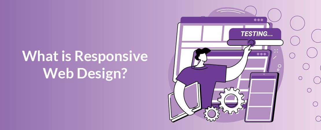
What is Responsive Web Design?
Not exactly sure what Responsive Web Design is? No problem! Let’s give you a brief rundown. Responsive Web Design is an approach to Website Design and development that ensures a Website's layout and content adapt fluidly to various screen sizes and devices.
What’s the point of this? It creates a seamless and optimal user experience across desktops, laptops, tablets, and mobile phones, eliminating the need for separate Websites or applications for different devices. This means that every single Customer can access your Website no matter where they are or what device they’re using!
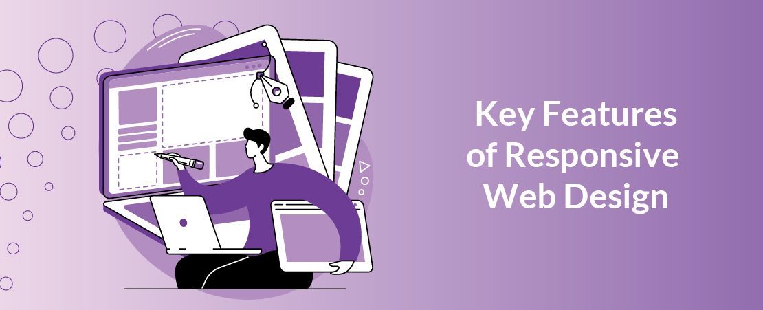
Key Features of Responsive Web Design
So, now you know what Responsive Web Design is, you may be wondering what it actually involves. Well, not to worry, we’ve got you covered in that area as well!
Flexible Grid Layouts: Responsive Websites use fluid grid systems that allow page elements to resize proportionally based on the user's screen size.
This ensures that content remains visually appealing and readable on different devices.
Flexible Images and Media: Responsive design involves using images and media that can adapt to various screen sizes. This may involve using CSS to control image sizes or employing HTML attributes that allow media elements to scale appropriately.
Viewport Meta Tag: The viewport meta tag is crucial for responsive design. It allows web developers to control the viewport's width and scaling on different devices, ensuring that the content fits the screen properly.
Progressive Enhancement: Responsive Website Design often follows the principle of progressive enhancement.
The basic content and functionality are delivered to all users, and then enhancements are applied based on the capabilities of the user's device and browser

Benefits of Responsive Web Design
While you are now up to speed on what Responsive Website Design is and how it works, you may still be wondering what the point of it is. How can it benefit you and your business? Well, keep on reading to find out.
Enhanced User Experience: User experience is a critical factor that influences how visitors interact with your Website and perceive your brand. Responsive Website Design
focuses on optimising usability and accessibility across all devices, making it easier for users to navigate, read content, and engage with your Site. By prioritising
user experience, Small Businesses can create positive impressions, foster trust, and encourage visitors to explore further and convert into Customers.
Improved SEO Performance: Search Engine Optimisation (SEO) is essential for increasing visibility and driving organic traffic to your Website.
Responsive Web Design plays a significant role in SEO, as Search Engines like Google prioritise
Mobile-friendly Websites in their rankings. A responsive Website ensures that your content is accessible and easily indexed across all devices, leading to higher search engine rankings, increased traffic, and improved online visibility for your Small Business.
Cost-Effectiveness and Efficiency: In the past, Small Businesses often maintained separate desktop and mobile versions of their Websites, which required additional time, resources, and maintenance efforts. Responsive Web Design
streamlines the development and management process by consolidating content and functionality into a single, adaptable Website. This approach reduces costs, minimises complexity, and enables Small Businesses to focus their resources on other areas of growth and innovation.
Stay Competitive in the Market: In today's competitive landscape, Small Businesses cannot afford to overlook the importance of Responsive Web Design. With an increasing number of consumers accessing the internet on mobile devices,
having a responsive Website is no longer a luxury but a necessity for staying relevant and competitive in the market.
By embracing responsive design, Small Businesses can differentiate themselves, attract more visitors, and capitalise on opportunities for growth and expansion.
Wider Audience Reach: With the increasing use of smartphones and tablets,
responsive design allows businesses to reach a broader audience, including users on various devices and screen sizes.
Easier Maintenance: Making updates or changes to a responsive Website is
more straightforward since there is only one version to manage. This reduces the time and resources required for maintenance.
Responsive Web Design is a foundational element of a successful online presence for any Small Businesses these days.
By prioritising adaptability, user experience, SEO performance, cost-effectiveness, and competitiveness, Small Businesses can leverage responsive design to engage audiences, drive traffic, and achieve their business objectives in the digital age.
So, what are you waiting for!? Embrace Responsive Web Design today and position your Small Business for success in the ever-evolving digital landscape!


