A Header and Footer, What Are They For?
Almost all Websites have a header and footer, but why? What makes them so useful that they have become ubiquitous? How do you use them? Why should you use them?
Here we’re going to answer all your questions related to the use of headers, footers, and everything in between! So settle in and let’s get started.

What is a Header and Footer
First up, let’s very quickly run through what a header and footer is so there’s no confusion.
The header is the section of a Website that appears at the very top separated from the main body of the page. They usually feature a company logo and one or more large images. There is also usually a navigation menu.
The main body of the page is where you can find the content visitors came here for, sandwiched between the header and footer.
The footer is the section at the very bottom of the page, separated from the main body. It usually has copyright information and a number of links.
With that made clear, let’s dive into what they’re for.
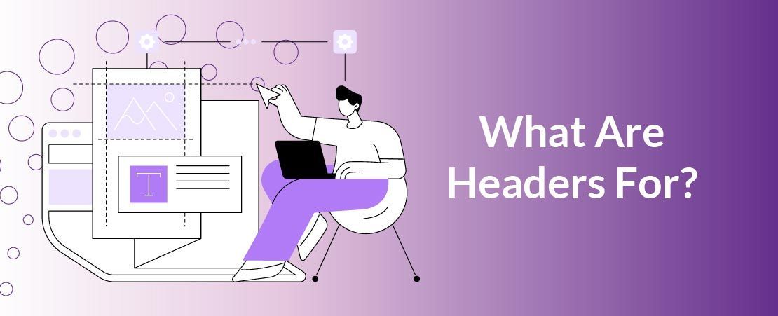
What Are Headers For?
Let’s start at the top of the page with headers, what makes them so great?
A header is the first thing visitors to your site will see, so it has the important job of making an amazing first impression. An unattractive header will start your visitor’s journey on the wrong foot, so it’s important to make sure your images are of top shelf quality.
With the tone set by your header, make sure that tone is consistent. Some sites like to go all out with their header on their homepage, then scale it back to a simple bar for subsequent pages. This is fine as long as your subsequent page headers read as simplified versions of that first header. Don’t confuse visitors with a jarring tone shift.
The next most important job of a header is to act as a guide. This means having some form of menu and sometimes also a search bar. If your visitors have somewhere they want to go, it’s in your best interests to help them get there as fast as possible. Every second they spend lost and confused increases the chance of them backing out and going elsewhere.
Don’t forget the Call to Action! Your attempts to convert visitors should start as soon as they arrive, so having a compelling CTA in your header is essential.
And just because they exist at the top of your pages, that doesn’t mean they have to stay there! Sticky headers stay on screen the whole time a visitor is scrolling, though they usually compact down to a few key elements to avoid taking up too much space on screen. This allows you to enjoy the benefits of a good header all of the time.
To summarise, headers are for making sure your visitors love your site right away, and helping them get comfortable and spend plenty of time with it.

What Are Footers For?
Now let’s get to the bottom of footers, why do you need them as well?
Research has shown that audiences are most likely to view content at the top of a page, with their attention trailing off the longer the page goes on (Another reason to have a good header). There is however a small uptick at the very end, that’s where your footer comes into play.
Web users know they can find useful stuff at the bottom of web pages, so you need to make sure that stuff is available for them to find. The things you’ll commonly find on a website footer are: logo & copyright notice, privacy policy link, sitemap link, contact information, and social media icons.
Why this information in particular? It’s because a footer works like a safety net, a final chance to catch anyone who has slipped through the cracks. If they’re still lost by the time they’ve reached the footer, this is your final chance to set them on the right path before they bounce back to the search results to try elsewhere.
It’s also a good spot to put information that just doesn’t fit anywhere else, like a copyright notice or a sitemap.
In short, footers are one last chance to catch visitors before you lose them forever.
Now you know what a header and footer is for, get out there and put your newfound knowledge to good use!
Your Website, Your Rules: How Inexpensive WordPress Hosting Empowers the Aussie Small Business Owner